My Home: Kitchen Tour
So I've been wanting to share this with you for a while, I'm sorry it's taken so long, but we've been snowed under trying to complete the rest of the house, finish a flat in London and keep on top of other work!
So finally here is the first room tour of the house in Dorset. For those new to the blog, my husband Patrick and I started renovating a Victorian carriage house in February 2016 (see previous post). It's been a labour of love, but we are almost there and the kitchen is one of the first rooms to be completed.
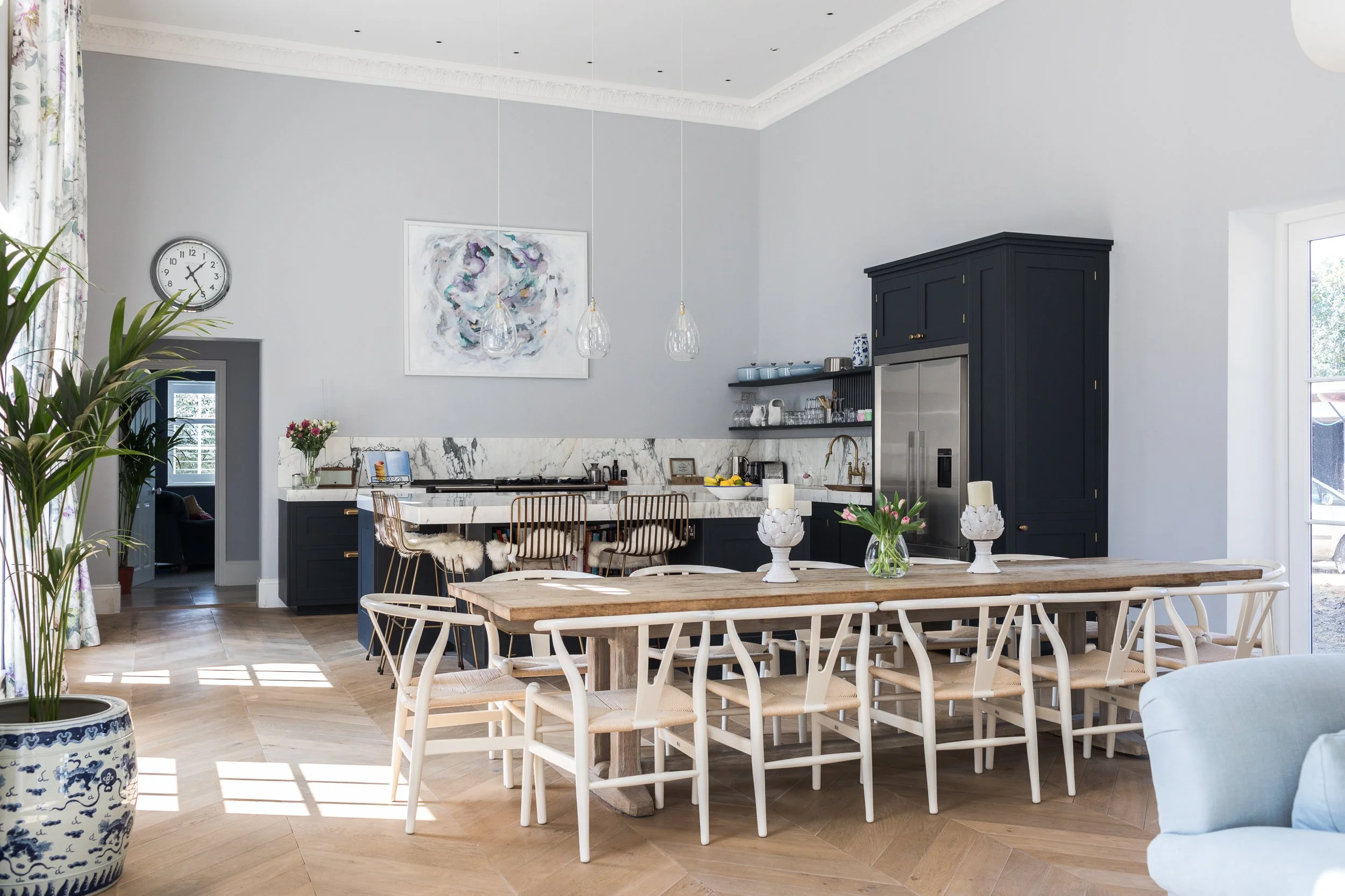
The room that we decided to house the kitchen in is HUGE - originally this was the space where the horses were stabled and is 16 meters by 8 meters by 4.5 meters high. We fell in love with this space when we first viewed the house and had wanted to make it our kitchen, living and dining room - a space we would use most of the day, every day.
When we started on the designs I started to feel nervous that the space was actually too large for a kitchen and that all the furniture would be lost, but I'm so pleased we stuck to our guns, as the result is a wonderful family space.
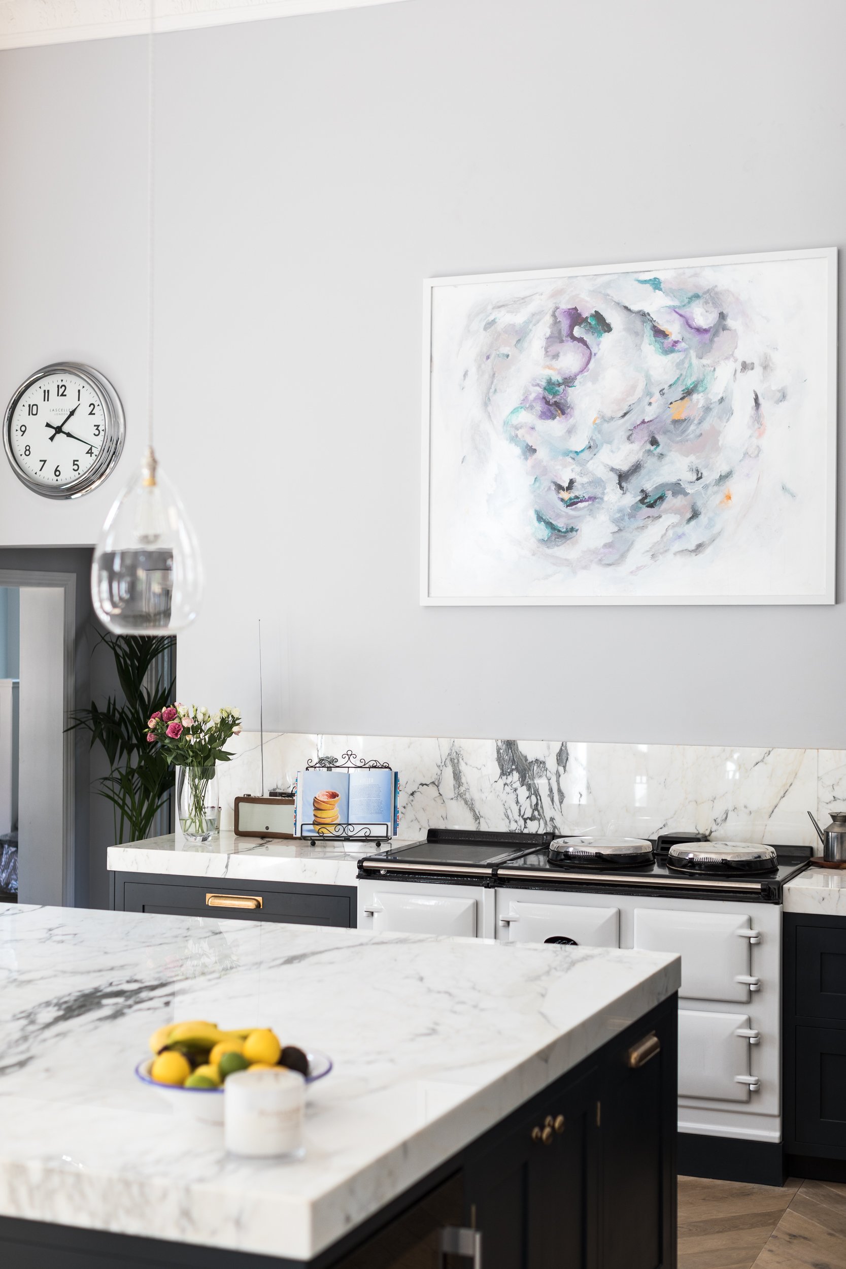
Being such a large space, I decided to paint the kitchen a darker colour than I would usually choose to really make it pop. After much deliberation, we chose Railings by Farrow & Ball and matched it with a super chunky marble worktop. Because the ceilings are so high, a standard worktop would have been lost in the space - so we were brave and went big!
We also chose to not have any wall units as I wanted the space to feel different to a traditional kitchen. I wanted it to almost feel like the kitchen just happened to be in the elegant living room, rather than the other way round.
We were lucky to stumble across the perfect dining table in the very early stages of designing the space. It was in one of my favourite shops in Sherborne, Circus - we didn't even own the house when we bought the table!
We just knew that if we didn't snap it up, it would be impossible to find something similar in the future. Luckily it did all work out - a bit of a risk, but there's always eBay!
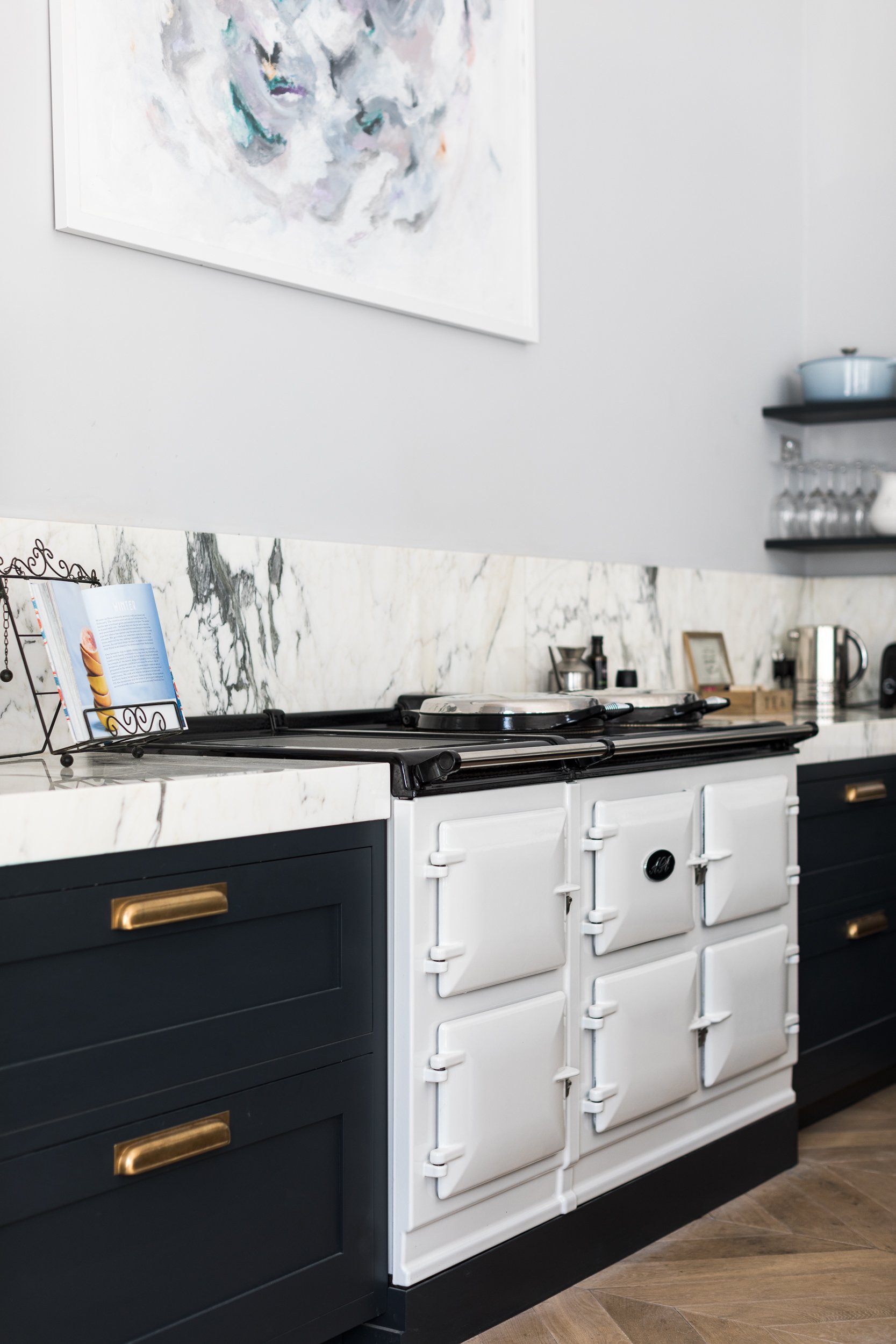
I've dreamed about having an Aga in our kitchen for years - as a child, we always had one and it is something that I am so pleased to have back in my life again. I chose a bright white colour to contrast with the dark units. We commissioned the gorgeous and talented Kristin Gaudio Endsley to paint a piece to go above the Aga - it is central to the room and so we wanted to make a statement. She did an amazing job, we love the painting and I get lots of comments about it on Instagram too.
Patrick designed these amazing shelves to go above the sink. We've had them in a few houses now and they are genuinely amazing - we never need to dry anything with a tea towel - it all just drips dry into the sink and it also leaves glasses totally smear-free!
We chose warm brass for the taps and cupboard handles, it contrasts beautifully with the dark paint and I love the overall feel that it gives - elegant and slightly decadent.
LBM x


