Room Tour: Menorca Kitchen
It has taken a little longer than I intended, but here is the first in a series of Menorca posts that will give you a full tour of the interior of the property, as well as give you lots of design hints and tips and links to shop the post to create a similar look at home. The first post shows you around the light, bright kitchen!
I often get asked what my inspiration was for this renovation and if I’m totally honest I don’t really know! I knew that I wanted it to be a fun, bright space, that would also feel quite decadent (think Slim Aarons Poolside Gossip and similar images). Somewhere to relax and enjoy the beautiful sunshine, so bringing the outdoors in wherever possible was key - I wanted to make the transition between indoors and out seamless.
Laura Butler-Madden's Menorca Home
Laura Butler-Madden's Menorca Home
Laura Butler-Madden's Menorca Home
I started with the tiles, almost all of which were from one of my favourite suppliers, Artisans of Devizes. I chose a beautiful blue and white tile for the main terrace, which is outside the kitchen and so that set my mind to thinking of pastels throughout the house.
For the actual kitchen units, we had to design and order them from the UK (when Lily was only a few weeks’ old) or we would have missed the deadline for installation in the Autumn, so we decided to go with our UK joiner and a simple wooden door painted lightly in Farrow & Ball Cornforth White, so you could still see the grain of the wood through the paint.
Laura Butler-Madden's Menorca Home
Laura Butler-Madden's Menorca Home
We also knew we wanted to have as much brass/gold in the property when it came to the fixtures and fittings, so we designed panels of brass to go underneath the worktop and also chose a beautiful shiny gold tap from my favourite tap brand Perrin & Rowe. I love their collection of taps – the designs are beautiful and they come in a great range of styles and finishes.
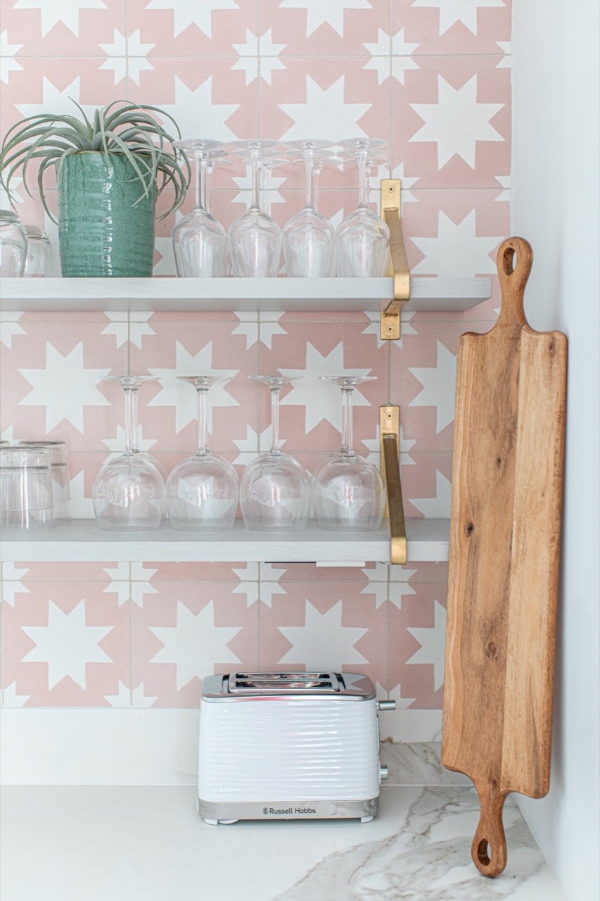
We always choose to have open shelves in a kitchen over worktop cabinets, as it keeps the space lighter and fresher and we also like to have our glassware and crockery on display. We sourced the brackets and had our joiner make the shelves, also painted in Cornforth White, to match.
Laura Butler-Madden's Menorca Home
Laura Butler-Madden's Menorca Home
We wanted a reasonably sized island in the space as well so that if a small group stays at the property, they have the opportunity to eat there – we love the social space it creates when people are cooking etc to be able to perch and chat. I always love to have pendant lighting over the island too, as it creates atmosphere in the evening and I always source these from the wonderful Fritz Fryer, a UK-based family-run business that have wonderful designs and the quality is amazing too.
Laura Butler-Madden's Menorca Home
Laura Butler-Madden's Menorca Home
The pink wall tiles are the main feature in the kitchen – I know I wanted something with an encaustic feel, hinting at the traditional Spanish tiles and I fell in love with these pink ones from Terrazzo Tiles. The colour really pops and creates the sense of fun that I wanted the house to have – it's a holiday space after all!
For all the crockery and glassware etc I sourced a mixture of Soho Home (I think important even in a rental property to have some really quality products) and lots also from La Redoute AMPM, Made.com and H&M Home. For more everyday things I didn’t want to spend too much in case of breakages. Finally, I have added some unique pieces that are very special to me, but also that I hope guests will love too.
Laura Butler-Madden's Menorca Home
Laura Butler-Madden's Menorca Home
These include my favourite bone china mugs and jugs from Alice Peto, which if you have followed me for a while, you will recognise from previous properties.
I hope you like it – room tours of the rest of the house will be coming soon!
Laura x
Laura Butler-Madden's Menorca Home
Laura Butler-Madden's Menorca Home
*Some products in this post were gifted, some were discounted in return for coverage and some of the links used are affiliate.
Photography by Patrick Butler-Madden


